
This means I'll probably have to instead opt for a poster print, and what's more , I should get on to it soon. To retain the transparency on the white parts I could cut them out and/or replace them with clear cellophane, although then I'm running the risk of ruining my print and having to pay for another...
_________________
In more recent news, I've since been working with the original image again, this time experimenting with text. I used both the colour and black and white versions in order to highlight the coin, which otherwise whited out into an indistinct circle.

The above image is my first, but I intend to make a series, experimenting with different words and combinations.
I've been taking words the stand out at me from the raunchy, hyper sexualized women's 'Cosmopolitan' magazine website by taking screenshots of the pages, then digitally cutting and pasting them into my image. I could have easily reproduced them myself to achieve higher quality, but I like the authenticity of using the exact text that I've seen on my screen, and the way in which the shallow writing also degrades in a visual manner when I enlarge the text to suit the image.
When I took the word 'lust' I saw that it already had some colour around it as a result of compression, so I took Thomas Ruff's technique from his "JPEGs" series and enlarged the word to 80,000 pixels (which took ages on my measly processor), before shrinking it back down again, then enlarging it once more to the desired size. The effect isn't very obvious in the version on this blog, but this is also due to the fact that I would've had to enlarge the text even more in order to create a noticeable effect. That, however, would probably be the death of my PC.
This idea is also very obviously linked to the work of Barbara Kruger.

The above image struck me while I was researching for my theory essay, and served as my main inspiration for adding text to my image. Kruger's work is also strongly based in Feminism, challenging both the objectification of women and male power. A critical difference between her work and mine, though, is that her text is directed at men, whereas mine is challenging the women. Kruger is challenging male actions and expectations, while I'm challenging the women to think critically about how they may be encouraging such things. My work is reflective of my belief that much of the sexism faced by women today is created by their own actions - forever falsifying their image and conforming to expectations, then complaining of objectification and shallowness.
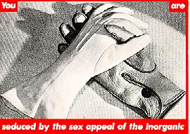
Another difference is that my text is taken from subject matter, while Kruger's is always added in her own way, giving her work it's distinct visual style.
So for now it's back to photoshop, then it's time to find some other women's websites full of self-degrading, dis-empowering advice...
No comments:
Post a Comment