I don't use blogger anymore.
New wordpress blog: Http://daniellecaddy.wordpress.com/

Monday, August 2, 2010
Wednesday, June 16, 2010
Key Points of this blog
The following posts show important developments of my work.
Initial Thoughts
Here you can see my original ideas and how they evolved into my final project.
Typology Experiment
This post shows the beginning of my presentation ideas and it possibly what led me to produce a series.
Finally...
Here are the first two versions of my original image.
Living Dolls
In this post my photography starts to investigate feminism and some of the concepts I'd begun exploring whilst reading 'Living Dolls'. Here you can also see the idea of presenting my work as a series.
Crossover with Life Drawing
Here you can see the development of my main photo into the image used in my final project.
New Images...
In this post I start to experiment with the idea of pixelation and how it can relate to degradation and loss of identity.
Version 4
Here is where I applied the idea of pixelation to my work. This was my final design, although while printing the grays and the size of the pixelation was tweaked.
Tuesday, June 15, 2010
Finalising Presentation
After much fuss and worry, my prints are finally done.
The colour came out quite different on the OHP paper, more greenish and yellowish but I think I like it better.
I had to re-print a few because the prints are so delicate and I scratched a few, also because a few of them were too light to be seen on transparency paper.
Thinking that I was on the home stretch, I bought myself some double-sided tape for mounting and went in search of a suitable window, only to find that the prints didn't show up on a transparent surface. Some turned completely clear both on sunny and dark windows. Also, things in the background distracted me from the image.
So at the last minute I was now searching for a suitable wall, and once I calmed down I realized that the perfect space for my work was still available, so I guess I was quite lucky there.
I ended up mounting my work with pins an inch or so out on a nice white wall at the end of the corridor, so hopefully it catches a bit of breeze from time to time so that the images flutter.

In the end my presentation turned out better than what I'd expected. Mounting my images on the wall with pins looked better than a window display ever could, and I think it had more relevance to my subject matter due to the way it shimmers and flutters.
My only complaints about the presentation is that I didn't consider that the glossy side of the prints would look best, and how when I flipped them around they would then be backwards. Of course, no-one else realized that my prints were backwards, but it still bothers me.
My other gripe is that I put the prints up in the wrong order. At first I thought my new arrangement looked better but now I've decided that the original order would have looked much better due to a better balance of alternating light and dark prints.

Saturday, June 12, 2010
Printing Dilemmas
So I finally Got my images to look how I'd like them to look and went to print them at school.
I had an epiphany that day with regards to how I'm going to print my images too. I was originally a little disappointed that I couldn't afford to print my image as a large enough window sticker, and I was worrying that even the largest poster size at most print shops was too small. So I'd come to the conclusion that It would be best to print the images out individually on A4 photo paper and then arrange them together with a gap. It was then that I realized that printing on OHP paper would also give me the transparency that I'd been wanting.
Now, I know that things are never supposed to work out when you're printing, so I was prepared for the fact that my images were completely the wrong colour on the properly calibrated monitors, and for the fact that the school computers run so slow that it takes the best part of half an hour just to alter a couple of colours, and I was prepared for my images to rebel and not allow me to change some of them.
I wasn't really prepared for a paper crisis though. Apparently inkjet ohp paper used to be really easy to get, but just since I needed it for my project, everyone decided to discontinue their stock.
What's worse is that I phoned up Stationery Warehouse and asked if they had any INKJET (with a capital INKJET) ohp paper, to which they say they had plenty. So I went all the way over there, and two employees double checked that it was the right stuff before selling it to me. I took it back to school and guess what? It wasn't inkjet ohp paper at all, but the prints had a lovely runny quality to them. Too bad they'd never dry. So I took the paper all the way back and waited 20 minutes for the supervisor to finish her coffee so that I could get a refund.
In short, don't go to Stationery Warehouse. They are dicks.
Anyways, in the end I ordered a pack of the real stuff from Office Max, simply because the guy who served me so so enthusiastic and eager to help. So now I have to wait until Monday morning to print. Lets pray nothing else goes wrong.
Tuesday, June 8, 2010
Version 4...
I've taken the idea of pixels and image degradation in relation to the loss of information and applied it to my earlier work.

Now the deviating image is surrounded by pixelated copies which appear more or less pixelated depending on how close they are to the red image. The closer they are, the worse they look and the more they blur in to insignificance.
This is following my theme of female ambition and showing the degradation and mediocrity of the social epidemic in which looking good is placed above doing what you're good at.
Now I just need to experiment to get the pixels the right size for the final presentation, so that the size of the prints doesn't obscure the poor quality.
Thursday, June 3, 2010
Am I Beautiful Enough?
This is gonna' sound funny, but last night I had the idea for a project in my dream. After I was done dreaming about having a cute white bunny that went with me wherever I went, I found myself in a store reminiscent of The Warehouse. The display TVs were all tuned to the music channel and there was a brand new video playing in which a well known pop beauty was singing a song with a chorus that went "Am I beautiful enough for you now?" In the video she was wearing no makeup or fancy clothes and her hair was as if she'd just got out of bed. Some people agreed that she was still just as stunning without all the wall paint, while I heard young men saying "that looks nothing like her!" disapprovingly.
When I woke up I knew this was a good idea for a project, but I was a little hazy on what words were being sung, which gave me another idea. While I was trying to remember I thought of "Am I beautiful enough for you yet?" which would be fantastic to use as well. I figured I could create a photo of myself with no makeup captioned "Am I beautiful enough for you now?", followed by another photo of me with tonnes of makeup on with the caption "Am I beautiful enough for you yet?" highlighting the contrast between wholesome beauty and unachievable perfection.
When it came to actually processing the first photo, I took things one step further and used photoshop in the opposite way to what a beauty photographer would. I made sure all the details of my skin were in tact and even did my best to highlight my blemishes and dark circles. I tried to magnify the truth rather than concealing it.

I considered finding the text for this elsewhere and copying and pasting it like I did in my previous project, but I decided that I couldn't justify the reasoning behind it and that the plain text was more personal and thus suited the image.
Wednesday, June 2, 2010
Thoughts on prints and presentation...

I actually printed that photo that I was talking about a couple of posts ago. I printed the words separately on photo paper then cut them out and pasted them on to the original photo along with a real $2 coin, so that it looked like I'd got the words from a physical publication. I then stuck a strip of sellotape across the words but it pretty much became invisible and didn't really carry the ideas I wanted it to, so now I'm just pretending that it's not there. I also removed the words "top story", because although they referenced the kind of media that this images opposes, it didn't quite read right when I looked at it. The words also arranged much nicer once I changed it.
For this version I purposely pixelated the face to show the degradation of the image in relations to it's message.
"What is the cost of your lust?" - although this was just a series of words I found on the websites of tacky magazines and strung together, it still holds a meaning with various interpretations and connotations.
It can be referring to the price of the clothes and products needed to achieve the narrow vision of the ideal female image presented to us by the media, and at the same time it can be referring to the cost of conforming to such a vision for both the individual and feminism as a whole.
It can be talking about the kind of hypersexualized image created by achieving the image that is expected of us, it can also be talking about a lust for money and material wealth in relation to achieving the ideal vision of femininity.
The pixelated image reflects the degradation that can be caused to the individual from the thirst for wealth and "ideal" beauty, as well as the degradation to women as a whole when individuals are going out of their way to sell themselves as a form of success.
As well as a real $2 coin looking better than just a 2d image, I added this because there is an instant feeling of greed generated by real money. It makes you want to rip it off the photo and spend it on something trivial, but you know that you can not because it will ruin the artwork . It is this feeling of the unattainable that I wanted to create, as the airbrushed image of femininity that the media sells us today is also unattainable. You can spend all your spare pennies on foundation and shoes, but at the end of the day you still won't look like the girls on the magazine covers, because even the girls themselves don't look like that.
It could also be read as an option: you can take the money and spend it trying to achieve this image, or you can leave it and pursue more wholesome goals.
The coin is also placed over an eye, so the face is hiding behind money, whether it be money spent on makeup that also hides the face, or an industry that exchanges an unrealistic image of beauty for money. The coin could also be there instead of an eye, so that the money is the thing staring at you, challenging you to stare back at it and not be sucked in to it's trap.
I am most pleased with the size of this image. It's the size of a snapshot, something personal that you can hold and view by yourself. It's like a postcard or a letter addressed directly to whoever's holding it, challenging them to consider what it says.
To emphasize this I may stick a stamp on the back and address it to "you" or "womankind".
I am still unsure as to whether this can be made to fit in with my final body of work. I'm thinking about my presentation a lot now, and contemplating the possibilities of having multiple images, however I wouldn't want this to be on the wall. It would have to be something that was distributed and held. I could perhaps have a small series printed of the top image and distribute them during my presentation, but then there's the question of whether they just get handed to the females or the males as well? And where would I put them?

New Colouring
I've fixed the colours on this one, brightening the red and making all the others uniform in preparation for printing.

At the moment I am unsure whether to print this as a poster as planned, as the price of printing at that size is quite steep and even the largest I've seen seems a little too small.
I'm beginning to think that it could be cheaper to print each of the 20 images separately on the school printers, then my overall image would be the size I want it to be, and I'd have a chance to play with the colours myself since they didn't come out right on the sticker print. It also gives me more framing and presentation options.
Sunday, May 30, 2010
Image & Text Development

So here's the second version of my new text based project. This time I found some words from a women's magazine called 'Allure', but also from a pretty decent feminist art blog that's part of 'Bitch' magazine's website (http://bitchmagazine.org/blogs/smart) which adds a nice spot of contrast. What's more, the words from the art blog are small joining words that are overpowered by the bold brightly coloured words from the women's magazines.
While typing this up I considered rearranging and cropping the image, so I produced this version.

To me, this second version looks like a post card or a photograph with clippings taped to it. It causes me to consider presenting the image in that way, with perhaps a real coin glued to the front.
New images...
My semi-transparent print arrived, but it's not quite what I was hoping for. Aside from it being a little yellow looking, it was exactly as ordered, but I've realized that it's far too small. I asked around a few people and they all agreed that it needs to be bigger.
This means I'll probably have to instead opt for a poster print, and what's more , I should get on to it soon. To retain the transparency on the white parts I could cut them out and/or replace them with clear cellophane, although then I'm running the risk of ruining my print and having to pay for another...
_________________
In more recent news, I've since been working with the original image again, this time experimenting with text. I used both the colour and black and white versions in order to highlight the coin, which otherwise whited out into an indistinct circle.

The above image is my first, but I intend to make a series, experimenting with different words and combinations.
I've been taking words the stand out at me from the raunchy, hyper sexualized women's 'Cosmopolitan' magazine website by taking screenshots of the pages, then digitally cutting and pasting them into my image. I could have easily reproduced them myself to achieve higher quality, but I like the authenticity of using the exact text that I've seen on my screen, and the way in which the shallow writing also degrades in a visual manner when I enlarge the text to suit the image.
When I took the word 'lust' I saw that it already had some colour around it as a result of compression, so I took Thomas Ruff's technique from his "JPEGs" series and enlarged the word to 80,000 pixels (which took ages on my measly processor), before shrinking it back down again, then enlarging it once more to the desired size. The effect isn't very obvious in the version on this blog, but this is also due to the fact that I would've had to enlarge the text even more in order to create a noticeable effect. That, however, would probably be the death of my PC.
This idea is also very obviously linked to the work of Barbara Kruger.
The above image struck me while I was researching for my theory essay, and served as my main inspiration for adding text to my image. Kruger's work is also strongly based in Feminism, challenging both the objectification of women and male power. A critical difference between her work and mine, though, is that her text is directed at men, whereas mine is challenging the women. Kruger is challenging male actions and expectations, while I'm challenging the women to think critically about how they may be encouraging such things. My work is reflective of my belief that much of the sexism faced by women today is created by their own actions - forever falsifying their image and conforming to expectations, then complaining of objectification and shallowness.
Another difference is that my text is taken from subject matter, while Kruger's is always added in her own way, giving her work it's distinct visual style.
So for now it's back to photoshop, then it's time to find some other women's websites full of self-degrading, dis-empowering advice...
Sunday, May 16, 2010
A brief analysis of my latest image...

In the latest version of my work, the defiant female image suggests a feminist undercurrent, yet this idea is watered down by the repetition. All the female images in their uniform colour, brown, tan, grey, green, black, white... blend together to create a collection of defiant yet bland figures, united in failing to convey their point, defeating themselves through mass uniformity. While the red image stands out at us, the fierce hue clashes against the passive tones of the others, and although the stare is the same, it seems to carry more weight in comparison. The red image defies the uniformity and self condemnation of the other nameless faces to create it's own identity.
I feel as though I'm closing in on a final idea with this image. Although further trials and tinkering is in order to establish suitable colour and presentation formats. I am currently waiting on a semi-transparent sticker print which I intend to mount on a window or on a sheet of perspex (for ease of re-location). I also intend to re-colour the present image to establish some uniformity with the colours, as currently, not all the browns are the same brown and not all the greens are the same green. I want to see what the image would look like with less colours.
Sunday, May 9, 2010
Tuesday, May 4, 2010
Crossover with Life Drawing
For life drawing, I used my coin image as a starting point for a self portrait, which came out something like this...


I photographed it to digitize it (because my scanner is too small) and have since been working on alternate colourings.
Here's a recent collection of the images that I like to call 'Prototype'. I'll get back to the significance/explanation/etc later on.

Here's a recent collection of the images that I like to call 'Prototype'. I'll get back to the significance/explanation/etc later on.

It's just a rough draft at the moment, so I'll be revisiting it to add more images, rearrange and change the colours.
Tuesday, April 27, 2010
Living Dolls Collection
Using the presentation technique I've been working with so far, I've compiled a collection of images from the Living Dolls shoot.

Living Dolls Shoot
Inspired by the book, I set out to turn myself into a living doll, playing out the extreme femininity and hyper-sexuality modern girls are encouraged to embrace.

I started trying to pose like an actual doll, remembering how Barbie would never sit on a chair properly. It didn't matter how you bent her legs, she always looked like she was kinda lying down on an angle rather than sitting. Frustrating!!


I then moved on to typical feminine poses...

Then on to poses inspired by the fashion industry.

Wednesday, April 21, 2010
Finally, an image I like...
Here's my first true success during this project. Created accidentally whilst trying to balance a coin over each eye. Turns out my awkwardness in trying to keep the second coin from falling made a cool facial expression.


Money and Portraits
This shoot had to be brief, so I feel as though it's quite unfinished.
Despite this I got some good images...

Looking at this top image, I can see that I've been influenced by Damo's tape project in sculpture, taking one of his ideas and applying it to what I'm doing without realizing. Oops.


I hate the dopey expression in this photo. It ruins it in a way.

The style of processing for all of these images is quite erratic, and I think an improvement would be to group the common images and process them in the same format.
Monday, April 19, 2010
Typology Experiment
Here I have placed a group of images of documents together to create a typology.
It was meant as an experiment, dealing with one aspect of my life and making a private aspect public, without revealing much of the private information.
I intended to create a sense of conflict and unease without disclosing what exactly transpired.

It was meant as an experiment, dealing with one aspect of my life and making a private aspect public, without revealing much of the private information.
I intended to create a sense of conflict and unease without disclosing what exactly transpired.

Sunday, April 18, 2010
Pimp My Blog
I've finally got around to updating this blog and making it all run like clockwork. You'll notice now that besides it looking better, there are also tags and links between blogs.
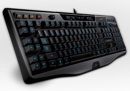
I've also finally invested in an illuminated keyboard, so I can stay up later without going mad from the amount of typos I'm making in the darkness. This means that I will also be getting around to updating this workbook with what I've been up to and some notes from my physical workbook.
 mmmm.... delicious.
I've also finally invested in an illuminated keyboard, so I can stay up later without going mad from the amount of typos I'm making in the darkness. This means that I will also be getting around to updating this workbook with what I've been up to and some notes from my physical workbook.
mmmm.... delicious.
Saturday, February 27, 2010
Poladroid
For fun I ran the images I took last week of my surroundings through Poladroid, since it's the trendiest program to use these days. I like Tom's idea of of creating one big picture of a life by displaying lots of polaroid shots like this together - except his was about 10x bigger than this.


A bit of fun...
I finally got a chance to play around in the studio and work on my mini-project of photoshopping images of myself. Here's one of the results.

Aside from that, the last 4-5 hours of my life have been dedicated to creating a new MySpace design for Soulseller, which you can see HERE

Aside from that, the last 4-5 hours of my life have been dedicated to creating a new MySpace design for Soulseller, which you can see HERE
Friday, February 26, 2010
Shoot with Allan
On Thursday Allan made us take a few snaps around art school. Here's two that worked out.


Tuesday, February 23, 2010
Shoot
This afternoon I picked up my camera and started pointing it at anything and everything.
I thought of the subject and decided to create a photographic depiction of myself by documenting me and my surroundings at that point in time.
My first instinct was to point my camera at the nearest shiny object, which happened to be my glass of scotch sitting in the evening sun. I toyed with the angles and lines created by the shadows to try and incorporate the surroundings as much as the subject.

 When I got bored of this (or just a little thirsty), I moved on to the general house and garden, finding everyday sights that I take for granted.
 Finally I turned my camera upon myself

Monday, February 22, 2010
Development
I've recently come to the realization that my project is turning out to be a continuation of my work last year.
Last year I dealt with the self-consciousness people feel because of the shallow media image, and had them cover up their insecurities with black cards.
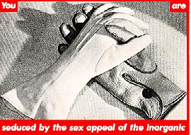
This time it appears that I am dealing directly with the media image and relating it to my own insecurities, except instead of covering them up, I am constructing a more desirable image like the people in Margi Geerlinks' Images.
Last year I dealt with the self-consciousness people feel because of the shallow media image, and had them cover up their insecurities with black cards.
This time it appears that I am dealing directly with the media image and relating it to my own insecurities, except instead of covering them up, I am constructing a more desirable image like the people in Margi Geerlinks' Images.
"A Personal Crisis - A Photographic Depiction of Ourselves"
An obvious topic to explore in relation to this idea is that of advertising and the mass media. However, this is a very broad topic and I will need to narrow my ideas down to specific issues within the media.
I feel that dealing with the issue of the "ideal" female image is becoming a bit cliche, as everyone is already very aware of the pressures and expectations places upon girls to be thin and flawless. Images of girls harming themselves through eating disorders and such are becoming all too common and somewhat hopeless as the shock value has worn off through repetition.
I'd like to somehow take this idea further and perhaps explore the subject in ways that aren't so common as to draw attention, not so much to the damage females are doing to themselves for the sake of beauty, but rather to the shallowness of society in general and the way many of us pretend to know better, while in our minds we are just as bad.
An idea could be to draw a connection to the brutality of raw animal nature and basic needs (eg, food, water, shelter, mating). An animal making a gruesome kill for the sake of hunger, could be likened to a girl throwing up for the sake of beauty in order to attract a mate.
Until I've developed a solid idea for my final project I intend to work with creating less thoughtful images that simply toy with the idea of media image, such as photo manipulating an image of myself that conforms to mass media standards (reducing weight, airbrushing skin, etc)
Subscribe to:
Comments (Atom)